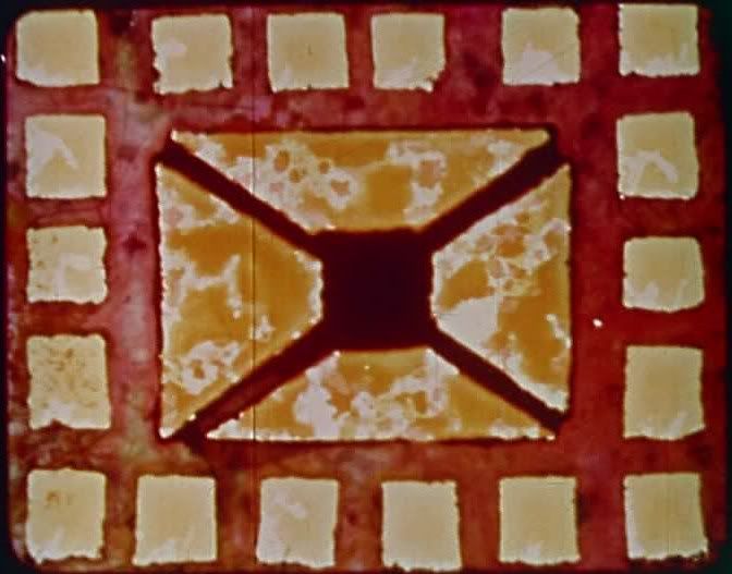

Harry Smith is perhaps best known for his stewardship of the famous Anthology of American Folk Music, an enthnomusicological attempt to preserve various folk traditions of the U.S. The multi-talented Smith was also an avant-garde filmmaker, and his 1946 Film No. 3: Interwoven was a work of lively abstract animation. Set to the music of Dizzy Gillespie, the film dances and bounces with jazzy rhythms, vaguely jiving to the same beat as the Gillespie tune but more just pulsating in sympathy with the music. The animation is geometric and colorful, with multicolored geometric shapes — mostly squares and rectangles, though a few circles and triangles show up towards the end of the brief short — shifting around the screen. Often, the quadrilaterals are arranged in tight grids, the internal boundaries of which are constantly shifting so that any given quadrant could pulse in size from a tiny box to spanning across nearly a quarter of the frame. These grids seem to be bouncing to their own internal groove, like there's a rowdy party going on and the whole place is jumping to the beat.
It gives the impression of architecture in motion, the boundaries all temporary, the straight lines deceptive because nothing ever stays in place for long — whereas most grids give the impression of rigidity and formality, this grid is fluid and free. Like jazz itself, it's structure in motion, structure with room for improvisation and movement, for unpredictability, for fun. It's hard to imagine a better visual metaphor for the spirit of jazz, this tension between structure/rigidity and freedom/motion. When Smith's shapes break out of the grid, dancing across the black space, momentarily suggesting bar graphs or rows of piano keys before returning to their abstract dance, it's even more suggestive of total freedom, though that sense of structure is lost.
Perhaps that's why the film's most compelling segments are the ones with that bouncing, shifting grid of colored blocks, where the borders are always changing and the colors leap unpredictably from one container to the next, creating fluid masses of shifting colors that dance across the screen, also in sympathy to the underlying beat. These images suggest so much, from tribal patterns or Oriental rugs — obvious influences — to color swatches and artists' palettes. In its suggestive abstraction, Smith's film doesn't merely accompany the jazz of the soundtrack or try to match images to the sounds of the music; it breathes and vibrates with the spirit of jazz, with the improvisatory and emotional intensity of jazz.


Tarantella is a 1940 short film made by the avant-garde animators Mary-Ellen Bute and Ted Nemeth (with additional assistance by Norman McLaren). The film is synchronized to the music of the composer Edwin Gerschefski, whose harsh, alternately speedy and minimal piano music evokes the spirit of the tarantella. Like the Harry Smith short described above, the animation is an attempt to visualize the music, to find visual equivalents for the sound and the mood of the music that accompanies these images. However, Bute and Nemeth take a more literalist approach to this audio-visual collaboration, as opposed to Smith's freewheeling evocation of an improvisation in color. Bute and Nemeth's geometric shapes are much more closely related to the music they accompany, acting as a kind of graphic notation after the fact. In particular, a recurring figure is a squiggly line that seems to wave and vibrate in correspondence with the music, like a sound wave visualization of the piano. In another sequence, colored bars on a black screen elongate and shrink in response to changes in the music, creating little visual beats that correspond to the changing tempi of the composition.
Such synchronizations come off as mannered and pat, too basic and obvious to be really interesting. The film is much more interesting when it mirrors the modernist spikiness of Gerschefski's music in minimalist forms in which jagged, hard-edged lines and lightning patterns oscillate in and out of view against a solid red background. In these stretches, the images don't exactly track the music but instead form a visual counterpoint, a logical extension of the music's aesthetic and sensibility into the visual arts. These minimalist patterns seem like a futuristic city seen from above, a map of the future with a large central thoroughfare, stretching diagonally across the frame, with little geometric figures making their abstractly anthropomorphic way across it.
Film No. 3: Interwoven and Tarantella represent two superficially similar approaches to music/animation pairings that nevertheless have very different effects in practice. They're interesting little experiments, two visions of the potential for a form of visual music in which colors and shapes take the place of notes and tones.

4 comments:
Very interesting, Ed.
I like Harry Smith's Early Abstractions quite a lot (which I included in a Top 100 Animations I compiled for Wonders in the Dark) but I haven't seen Interwoven
"However, Bute and Nemeth take a more literalist approach to this audio-visual collaboration, as opposed to Smith's freewheeling evocation of an improvisation in color."
I agree that the representation can lose itself if it is too literal. If you've seen Len Lye's Swinging the Lambeth Walk (it's on YouTube) it is very much in the Smith style.
I try not to think too much or over-analyse when I watch animation like this. It's meant to be received as freely as it is given.
Thanks for commenting, Stephen. I agree that it can be tough and maybe counter-productive to analyze this kind of abstract animation. The "point" of it is to be viscerally and aesthetically compelling, and likely to produce different resonances and associations in different individual viewers, so there's not actually a huge amount to say (at least for me).
I've seen a few Lye shorts but I honestly don't remember if that's one of them! Time to go check it out.
It's a fascinating fusion and a work of hybrid art that's always worth exploring. I'm sadly delinquent in previous exposure to Smith, yet this brilliant examination in a connected way brings to mind the sense of the abstract, with Malick's TREE OF LIFE recently wedding sight and sound in an impressionist way. But I know this is a complete different form here, and this treatment furthers the literature.
Thanks, Sam. Tree of Life definitely uses some avant-garde techniques, and the creation sequence especially seemed like a Brakhage film or something at times. The avant-garde has had a huge influence on narrative cinema, of course.
Post a Comment